AN INSIDE LOOK AT TETHER.
It's been a while since I last spoke about a client project that I've worked on, purely because it's still going to be a while before most of them will be in the public eye. That all changed at the beginning of this week though, because I'm very excited to say that Tether went live on steam greenlight! So I thought I'd write a little bit about what the experience has been like and show some of the art work that will be in the game. But first, a little bit about Tether....
'Tether is a first-person adventure game based in a dilapidated science fiction world. Earth is dying after the collapse of several continents throughout the world following the destruction of the Moon - as natural disasters sweep the planet, the newly formed United Environmental Federation (UEF) accelerate plans to terraform the nearest possible habitable planet, Mars.
You play as Lesleigh Hayes - a Biological Research Assistant for the UEF - on her first deep space voyage to Mars. Once aboard the Sonne, Lesleigh's thoughts turn to her children as she re-lives some of their final conversations before leaving. As catastrophic events unfold on the UEF Sonne, Lesleigh is forced to survive the psychological horrors of isolation in deep space.
Can she live with the consequences of her choices? How will these affect her children? Is this how motherhood should be?'
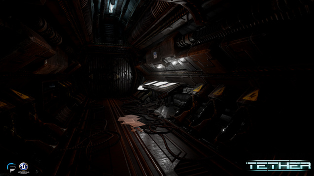
Here is also a couple of screenshots from the game to give you a better idea of the visuals before I start sharing my contributions to the game! (I'll also post the trailer at the end).
As you can see it's got a pretty dark, creepy atmosphere and I'm looking forward to sharing more with you guys, so let's talk a little more about what I've been working on for Tether. I'm sure you're probably thinking that this isn't a visual style that would usually be associated with my particular illustration style, however, the 2D assets that we required for the game needed to be in a style much closer to the one I work in. So when I was asked to join the team at Freesphere Studios I gladly took up the opportunity as I also knew it would be a great experience to work at part of a team which I haven't done since I went freelance nearly 3 years ago.
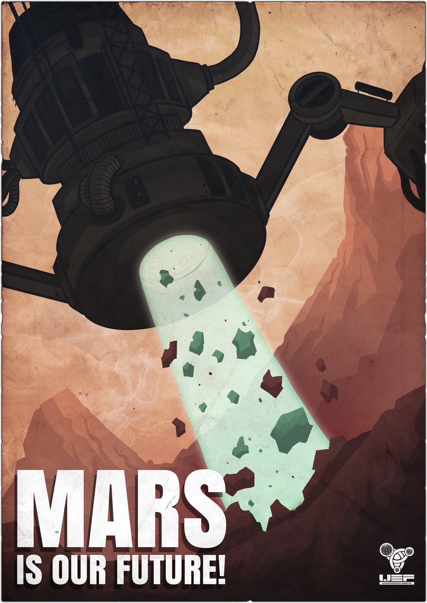
The main assets that I have worked on so far are in game posters and also some spray painted graphics for the walls (one of which you can see in the trailer which says 'NO HOPE'). All of these posters are propaganda so they are supposed to look like they have been produced by the UEF in an attempt to make any employees feel better about the work that they're doing.
First up was the 'Mars is our future!' poster showing Mars being terraformed. This one was definitely one of the harder ones to nail down purely because it was my first piece of art for the project and the first time I'd ever worked on anything like this so it took a lot of sketching to get the initial style of the machine right so that it fit into Tether's world.
It also took a few attempts to get the composition right, I created a few variations and sent them all over to the team. The end poster needed to show how big the machines actually are and look slightly intimidating, so I wanted to try and go for a worm's eye view. I think the end composition works well and definitely portrays the desired feelings.
The next poster was by far my favourite piece that I got to work on, it was one of those where as soon as I read the brief I got an image in my head and that ended up being the pretty much exactly what it looked like in the end. It doesn't always work out like that though I can assure you! This poster basically needed to be the UEF's take on the meme 'hang in there kitty' so I wanted to try and pull this off in a cartoony sort of style which in the end I think paid off well!
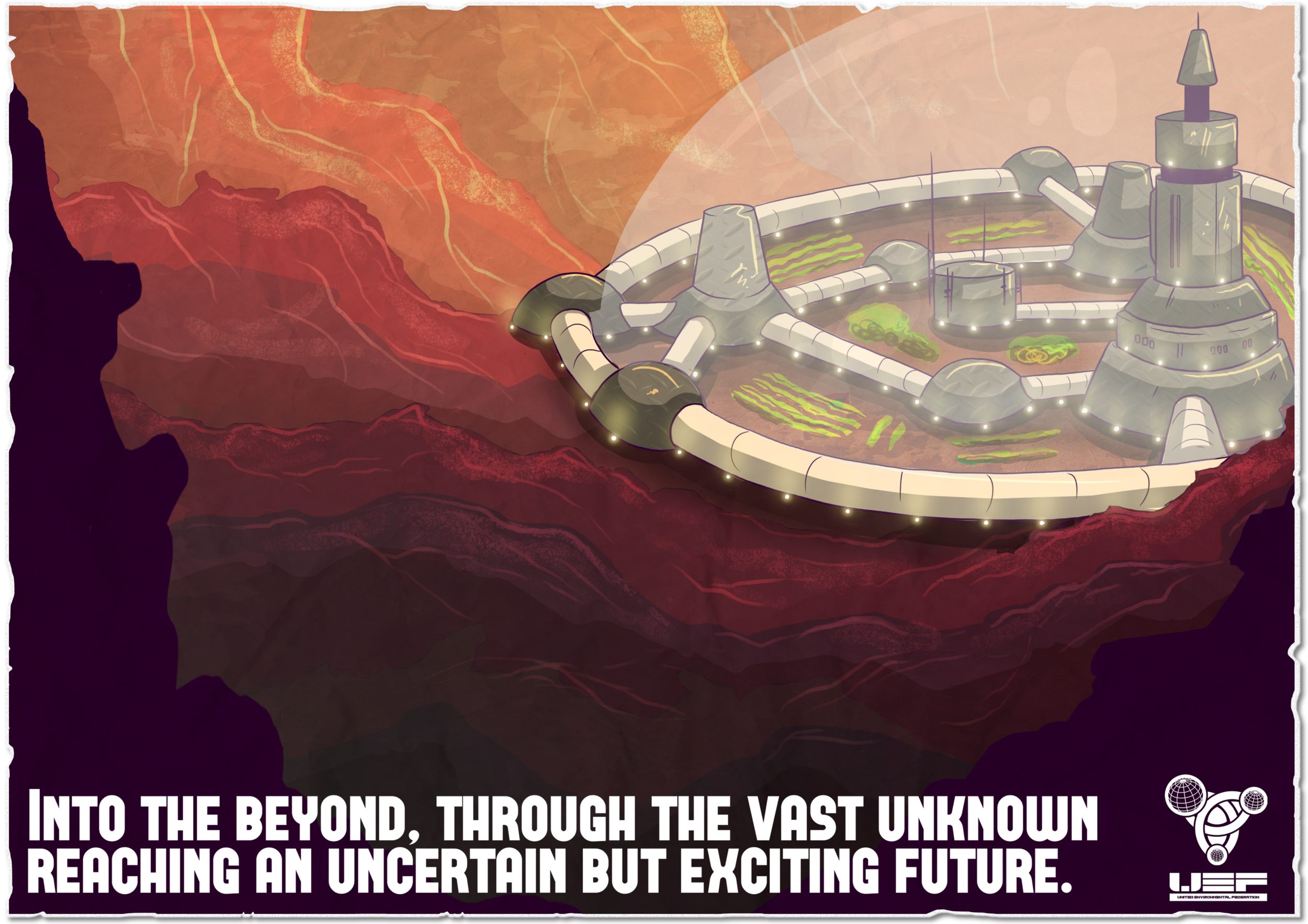
Last up I'm going to talk about the Sonne base poster. This was one of those where there were real highs and real lows haha. I knew that I could inject some of my own style into this, which I did, I drew it up in my own style and also used to the same process as I normally do whilst also trying out a few new techniques. However, I still had to make it look like it was part of the same world, that goes for the poster itself and the actual base. The look of the base itself was fixed with a simple dome over the top but I can't tell you how long it took to get that idea and for it to actually look right! It took me a good couple of days, looking away from the screen and coming back to it to get the poster itself to look the way I wanted it, for instance the colours, which were the main problem for me because the atmosphere in the poster needed to look warm but also still look like Mars, so it was important to get exactly the red kinds of reds.
Clearly there is a lot more to the game than just posters though! Being a part of the Freesphere team means I get to see every part of the game, how it's being built and what it looks like when it's finished and I can't tell you how great it is to see how much work everyone has put into this and what has come of it. I've said it before and I'll say it again, the absolute best thing about this job is getting to see your work as an actual end product and finally see all the effort that has been to put into it!
This is only the beginning however, but I thought I'd share this now with the game launching on steam greenlight, so it's a great time for people to go check it out, watch the trailer, leave any feedback and put in a vote for the game! Here's the trailer for the game with some amazing voice acting and creepy effects, a gameplay trailer is also coming very soon!
If you are interested in the game and would like to see more, be sure to check out the social links on the steam greenlight page!
Thanks for reading!


