Ghostbusters Fan Art
Christmas is creeping upon us, so this will be my last blog post for 2 weeks, I'm planning on posting another before the end of the year though, looking back on my work for this year, my plans for next year and some projects that I am still yet to share with you (one of which includes farting and unicorn in the same sentence!). But today, I thought I'd share a piece of fan art I created a couple of weeks ago for a zine produced by Sheffield Zine Fest.
I saw a post on Sheffield Zine Fest's instagram asking for people to submit to a new Ghostbusters zine they were working on putting together, I'd not long since seen the new film, which I loved, so I was determined to be able to be a part of it. I'm going to share the process of creating the piece from start to finish.
First up were the sketches, I had a while for the deadline on this project but I was also working on the X-Gamer project at the same time, so I couldn't really devote so much time to this that it replaced the time I had to work on the X-Gamer work. So I had a pretty good idea of what I wanted the final piece to look like and just ran with it. I decided that the best way to execute this was to sketch out each character individually, put them in their place in Photoshop and add everything else in around it as I went. Here are the initial sketches....
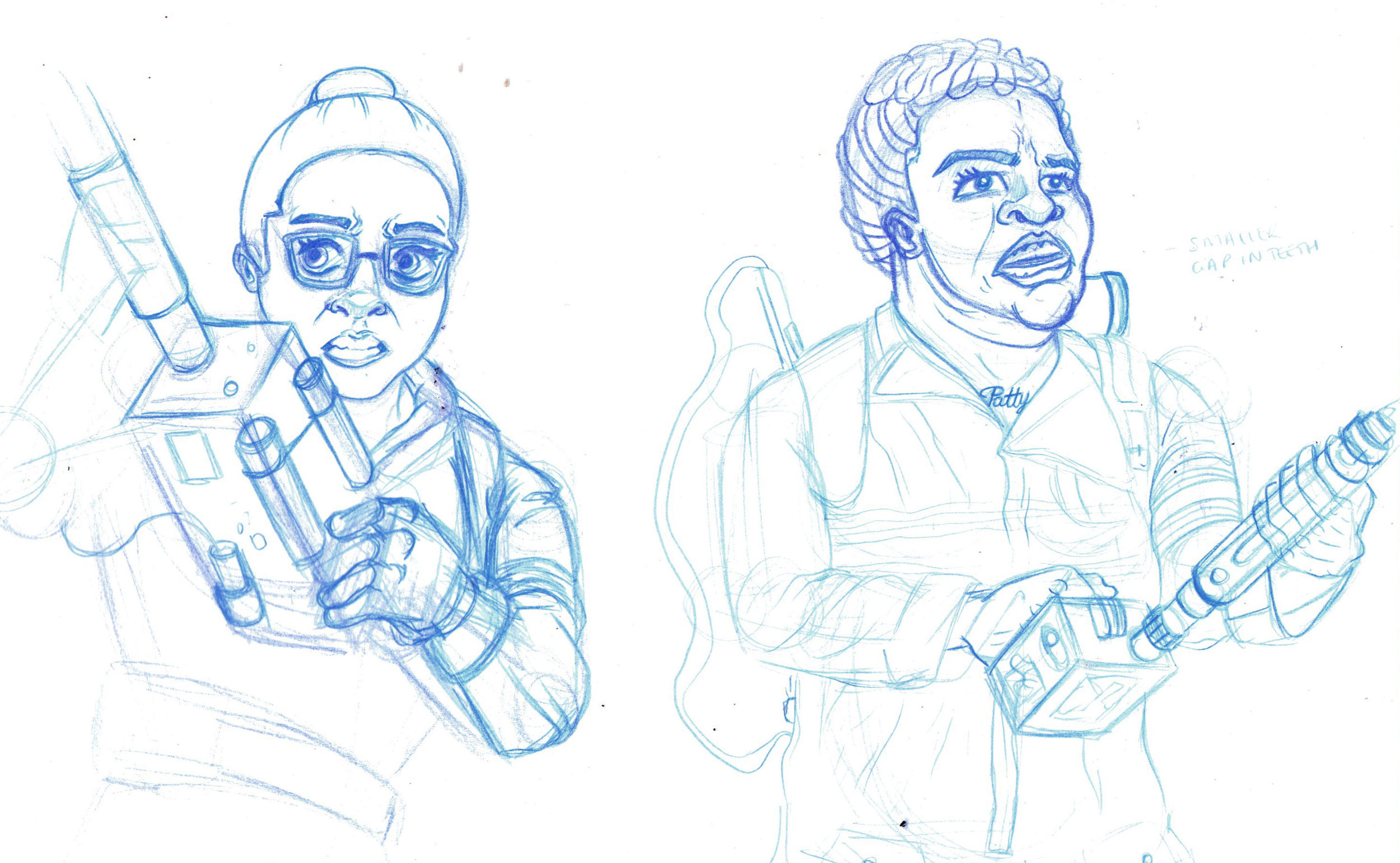

Because I couldn't spend too much time on this I kept to my usual techniques with a few experiments here and there. So next up I line worked the whole piece in Manga Studio, making sure I kept each element on a seperate layer.

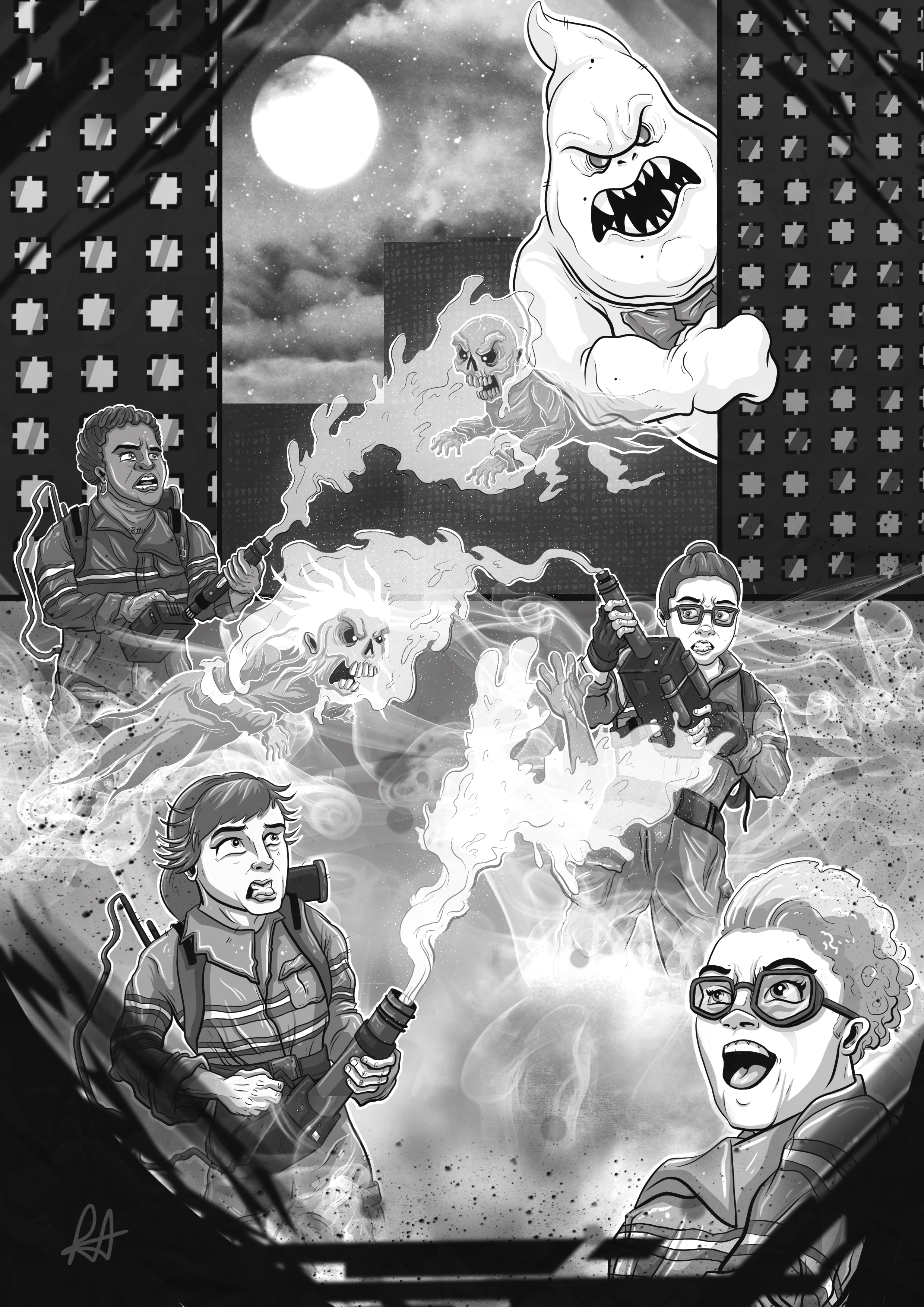
The zine itself was going to be printed primarily in black and white which is how zines are usually printed to keep production costs low, so I decided to do the whole piece in black and white so I could see exactly how it would look when printed rather than doing it in colour and just hoping it would print alright!

It took me a while to establish the right values with the flat colours to ensure each character stood out from each other and the background whilst also making sure that their clothes, skin, hair etc. had the right sort of values for what colour they are. I added the shading next which always helps to add some depth to the image and gives the characters some life.

I was pretty happy with how the piece was coming along, which is not something that I can say very often! Once the shading was finished, I added in the lighting, I usually add a lot more lighting but I didn't feel like this piece really needed it and I was happy to keep it quite simple.

Because of the layout of the image, and the size of the zine, I had to be really careful with the composition and how I used the space. It was difficult to have the characters so close together, but also to try and make it look like they were stood behind the person in front of them. I knew that the horizon line/background would help with this. So I focused on that next, adding elements and details to give the illusion of depth even though it was pretty flat to start with.

This is the part where I wanted to try out a couple of ideas. The main concept behind the illustration and Ghostbusters itself is obviously, that they catch ghosts, and the proton packs/guns are a big part of that. So I wanted to try and frame the illustration nicely whilst also trying to get the energy across of what was happening. So I had a play around with some brushes I downloaded over the years and I think in the end, although it's abstract it gets the feeling across that I intended.

Here it is all finished up!
Thank you all for reading this and I hope everyone has an awesome Christmas!