Weekly Sketch Round Up.
If you know me personally, then you'll know I'm a big gamer, especially of games that are less realistic visually and more cartoony in style so games like Ratchet & Clank and Plants VS Zombies are my favourites. I have way too many games and so many I still need to get through, I don't drink alcohol or really go out, so games are my main entertainment and what I occupy myself with when I want to chill out for the night.
So if there is a new game coming out and an open player BETA goes online I will usually always try to have a go and try the game out. I downloaded the Overwatch BETA last weekend, purely for fun and have now placed a pre-order based on my experience with it. So I decided this week to create a couple of illustrations based on the game for some practice and to try and just have fun while I'm creating rather than feeling stressed or pressured about the process.
One problem I have when I draw from reference is that I tend to draw what I'm seeing to ensure I get details and proportions right, rather than drawing my own interpretation. So I thought a nice exercise for these sketches would be to draw the character, scan it into Photoshop, warp and adjust it so that it looked more how I wanted it to and then print it out and ink it.
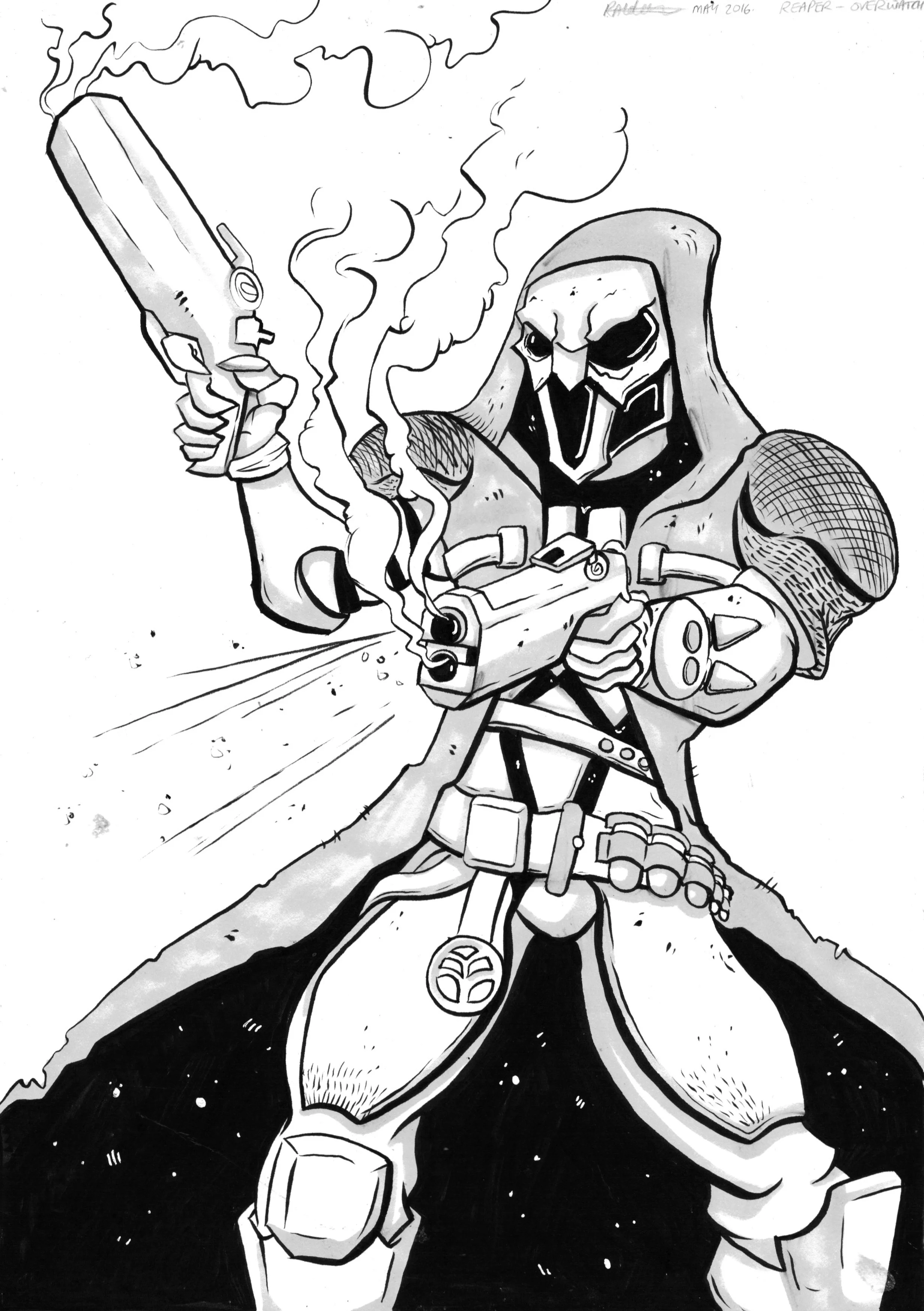
First up, was one of my favourite characters from the trailer and initial impressions of the game, The Reaper! I've absolutely love black and skulls in general, and that's pretty much what he is.
Reaper image source: https://www.youtube.com/watch?v=oRpW4tS9_Ac
So above is my sketch after I edited it in Photoshop, so you can see the white spaces where I've moved elements around and changed their size to improve composition. I also added some rough guidelines for gun smoke and some lines to make his cape more dynamic.
I printed him off and then put my sketch onto my light box, placed some card over the top and inked onto the card, I then used a grey marker to put in some shadows too. I would've liked to spend more time on this, but limited myself a little because I tend to want to properly finished every single sketch and it just distracts me from more important work.
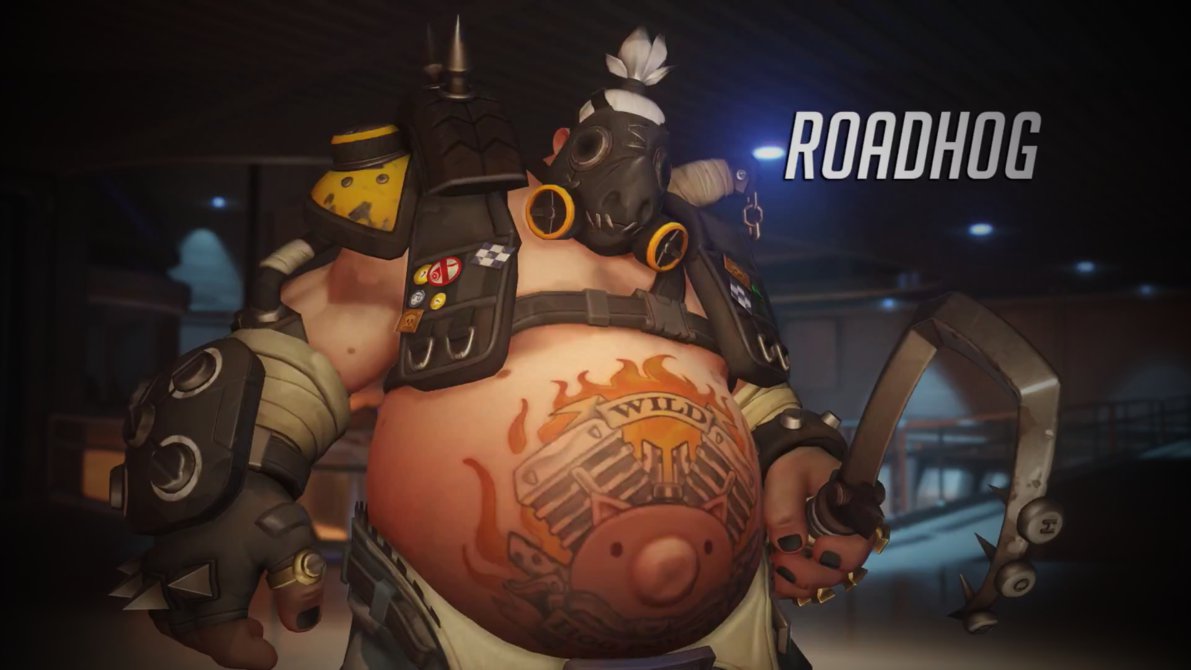
Next up was Roadhog, I absolutely love this guys design, I loved it before the game was launched and when I actually tried him out in the game I was over the moon with how awesome he plays, his abilities and they way he moves.
Roadhog Image Source - http://mac117.deviantart.com/art/Overwatch-Roadhog-Wallpaper-1920-x-1080-561993103
Because I love this guys design so much, I decided to spend a little more time on him and added a splash of colour to make him really stand out. I used the same process as the reaper with the light box and markers etc. I think this guy turned out much better though because of the added colour and I think all of the extra details on the outfit really help, if you're planning on buying Overwatch, the unlockable costumes are amazing!
Now, if you've been following me for a while, you'll know that I usually draw monsters or male characters, because I am not happy with the way I draw females, I know I'll get there eventually because I couldn't always draw males and monsters either, but it just takes a lot of practice, so I decided to go with a female character for the final drawing of the week. I was going to go with a character called Mercy based on initial impressions of the way each character looked, but after seeing Widowmaker in the game, I REALLY wanted to draw her, after all she's a badass female sniper which is beyond cool.
Widowmaker Image Source - http://overwatch.wikia.com/wiki/File:Widowmaker_Overwatch_004.jpg
This is the one I spent the least time on, and although her eyes aren't right and she's a little cross eyed, I'm happy I drew her and added some more time spent practising to my craft.
If you enjoyed these, then please keep an eye out for my next vlog coming in just over a week where I'll be posting some clips of the process of the first two and probably filming more sketches next week.
Thanks for reading!


