The Dinosaur Knight
I'm just going to start this post by saying that I've been posting the wrong name for this game all along! Well, it's not completely wrong, and it's not that I didn't know what it was called, but because I have a few client jobs I always just use something simple and easy to differentiate each project, so for this project that was 'Fusion Earth'. So just to clear things up, it's actually called 'Escape from Fusion Earth' which makes much more sense and something that should've clicked when I wrote the first post! Oops, sorry Riley!
I hope that you guys are enjoying these posts introducing you to the Escape from Fusion Earth world and characters whilst also showing you the process behind the 2D art in the game. I feel like this project and the client have really encouraged me to push my creativity, ideas and techniques to take my work to the next level, which is always exciting because I felt at a stage in my work where I really needed a challenge and this project has been perfect for that. The project as a whole has challenged me and each character design has challenged me in it’s own way too, and the Dinosaur Knight was tough in areas that others weren’t and because of those obstacles it’s turned out to be one of my favourite illustrations I’ve done to date. So let’s get into it!
Now, anyone that knows me or has been familiar with my work for the past 2 years at least will know that I absolutely adore dinosaurs, I have always been fascinated by them since I was a kid, but only about 2 years ago did I start drawing them, this was when I finally got my head screwed on a bit and realised that I should be drawing what makes me happy, not what makes other people happy or want to give me likes on instagram. The dinosaurs I’d been drawing is partly what landed me the chance to work on Escape from Fusion Earth in the first place, and because I am so genuinely passionate about dinosaurs, I’ve always been into learning about them, new discoveries, reading about their defence features etc. which means that I had already built up quite a lot of information and sketches to give me a starting point for this particular card. However, as you can tell from the title, the dinosaur wasn’t the only character for this card, there was another character that needed to be designed, and that was the Dinosaur Knight himself.
When I started sketching the character, he was actually listed on the Escape from Fusion Earth document as ‘Dinosaur Savages’ (I’ll explain the name change later in this post). So I started to think about what this guys armour and weapons would look like, how would he protect himself? What kind of weapon would he have? What tools would he use to craft his gear? How would he sew the armour together? etc. It’s helpful to ask all of these questions and create a backstory for the character because it 100% helps you get a better idea of the character and who they are, how they should look, and it also helps to create a character story for the viewer, leading the viewer to discover through the design of the character how they got to where they are now. I sketched down quite a few ideas based off the brainstorms and thoughts that I’d had, and kind of felt in my element. Although both I and the client were happy with the character designs, there was just something not quite right.
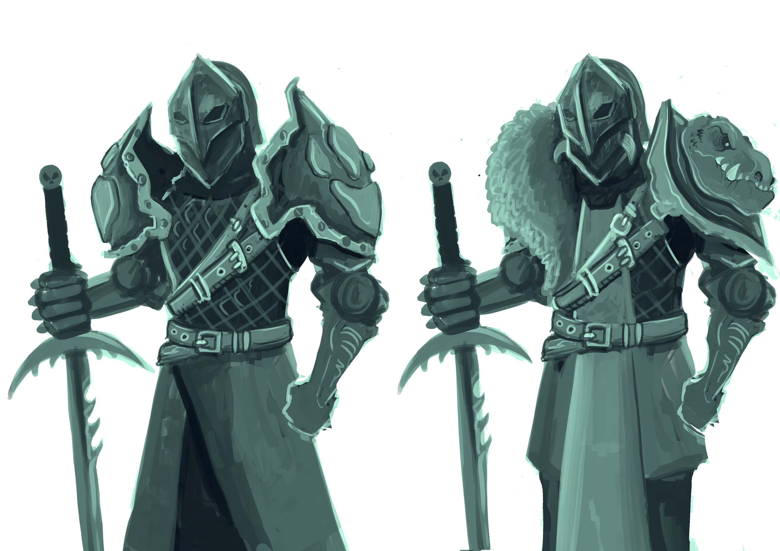
It took us a while to work it out, but after a lot of sketching and ideas, my client, who is also a creative in the industry which is always super helpful when you need a fresh set of eyes, suggested that he was too similar to the Zombie Viking. On the surface people might not see that, but I completely got what he meant, when you’re a character designer, you know that the most important element of a successful character design is the silhouette. So even though the Dinosaur Savage was unique, I could instantly see without even creating filling in his silhouette that his shape and build was too similar to the Zombie Viking, so it was back to the drawing board! My client came up with the suggestion to have the human character as more of a knight, which would immediately create a much more unique character and create a bigger contrast between him and the Zombie Viking. I’ve never drawn a knight before, so I spent a couple of days researching real knights and knight armour, but I knew that I also wanted this knight to have a more stylised look, so I also got a lot of reference from games such as Heroes of the Storm and League of Legends, along with rooting through old sketchbooks for ideas.
I drew up quite a few ideas, and really liked two of the more refined ideas. I think that the one on the left still tied into the savage idea a little, his armour looked handmade and he looks like he has used a lot of found items, which wasn’t a problem now that he was clearly a knight. The one on the right looks a lot more gritty and dark, which wasn’t the direction I intended to take but after sketching him up I really liked the way he looked. The client was happy with both, and happy for me to go with which ever I felt was best. I was very keen on going with the knight on the left, but I knew that I wanted to try something different and felt like the guy on the right looked a lot more threatening, and I could imagine that if he was coming towards you, you’d feel a lot more worried. I also realise that he has no way to see through his helmet, but I kinda like that because I think it gives it a fantasy feeling, sort of as if he’s this cursed knight who just rides around and always hits his target.
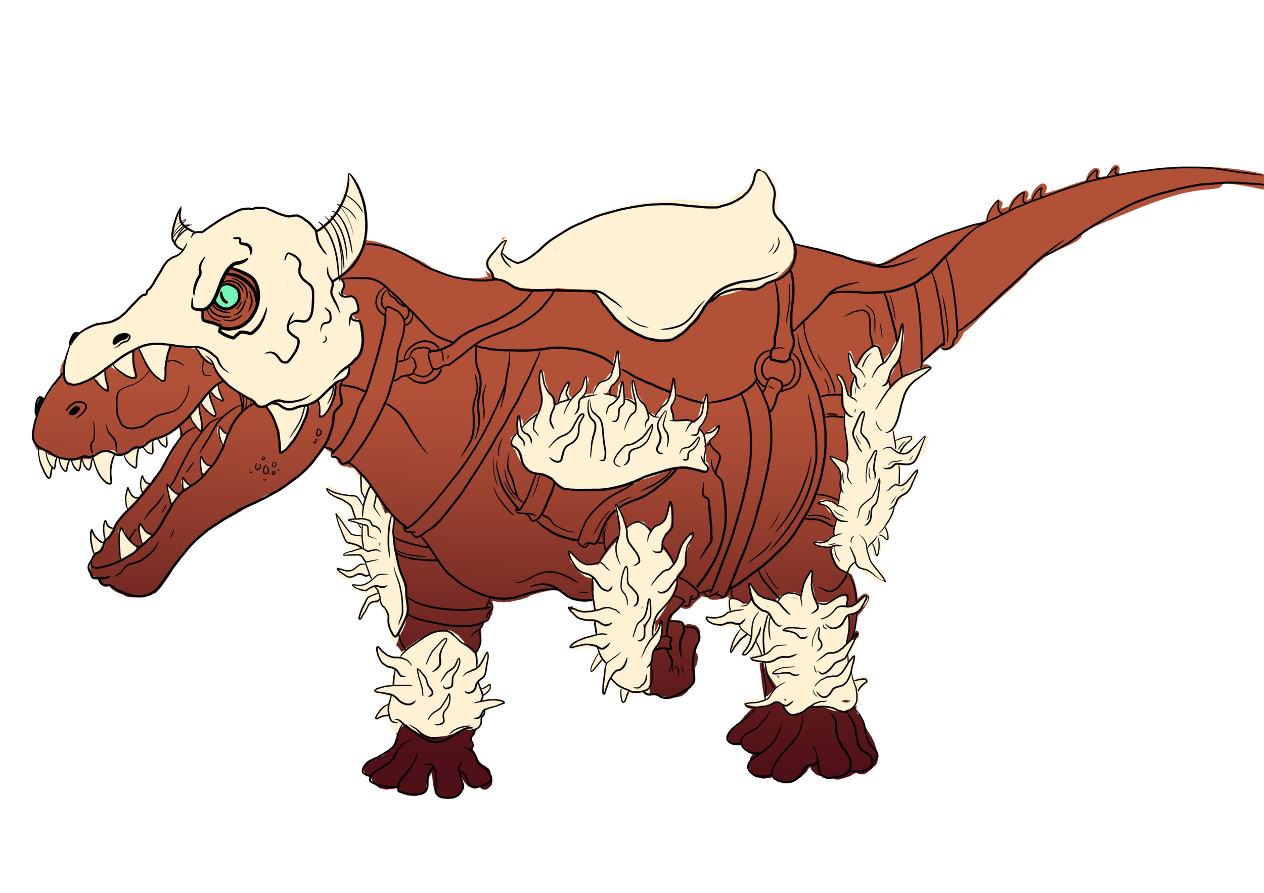
Obviously now he needed his dinosaur companion, I was pretty confident in my ideas and where I wanted to go with it, so just drew up some rough sketches. Initially I drew up the dinosaur above, but the client made a good point about the card being portait so it would be better to have a bipedal dinosaur. I started thinking he either needed a big chunk dinosaur with a lot of power, like an even more bulked out T-Rex or a fast dinosaur such as a super sized raptor, I’d also drawn this dinosaur a while ago, sort of based on a T-Rex but with a really over exaggerated strong looking jaw which has loads of teeth sticking out everywhere, which was the one I decided to go with in the end. Of course he had to have a little skull helmet too!
When it came to designing the actual card, it was a little tricky getting the composition right as the client had a really awesome idea and wanted to make it look like the dinosaur was about to attack the viewer. After sketching up a few rough examples, I realised that it was difficult trying to fit such a pose on a portrait illustration, if it was landscape it would’ve worked perfectly, but these cards are portrait so I had to try something else. Instead, I went with a pose where the dinosaur is sprinting along and the knight has pulled him back as if to stop the dinosaur or slow him down. I felt like it fit in the frame better but was still a powerful post at the same time. The colouring of this piece was pretty straight forward, I used one of my dinosaur books to get a reference idea for the pattern on the dinosaur and then changed the colours up a little, using complimentary colours for the dinosaur and the knight. I’ve recently started learning more about digital painting and concept art for games, I obviously use a lot of line work in my work but I’m interested in trying to pull away from that a little and get a more concept art feeling across in my work, so painted in the birds just to try something new and feel like they give the illustration that extra pop and make it feel a little magical.
Cheers for reading guys, I'll be sharing another card next week, there's something a little different about the next character though....


