The Zombie Viking!
So, it’s been a little while since I last wrote a blog post! One of my goals for the year was to keep up my weekly blog writing but due to having a rough few months in my personal life, I decided to take a few weeks away from the internet in general, and it was well worth it! It’s something I’m thinking about doing every year from now on, maybe in January to give me a nice fresh start to the year, I’d highly recommend it!
But back to it! I’ve been wanting to write this blog post in particular for quite a few months, but due to the whole project being a bit of a secret, I had to keep it quiet and contain my excitement. However, in the last few weeks the project has started to be shared with the public eye, so I can finally show you guys what I’ve been working on for close to a year!
Last year, I was contacted by a client who wanted some characters designing for a card game. This is another example of when my personal work/projects has sparked the interest of a new client. I was drawing a lot of dinosaurs and characters with bone/creature inspired armor and that type of imagination is exactly what the client was looking for to develop these ideas from a name into a fully visualised characters. I’m going to share these characters one by one, so each week I’ll share a new character and the process behind designing and fully fleshing out that character.
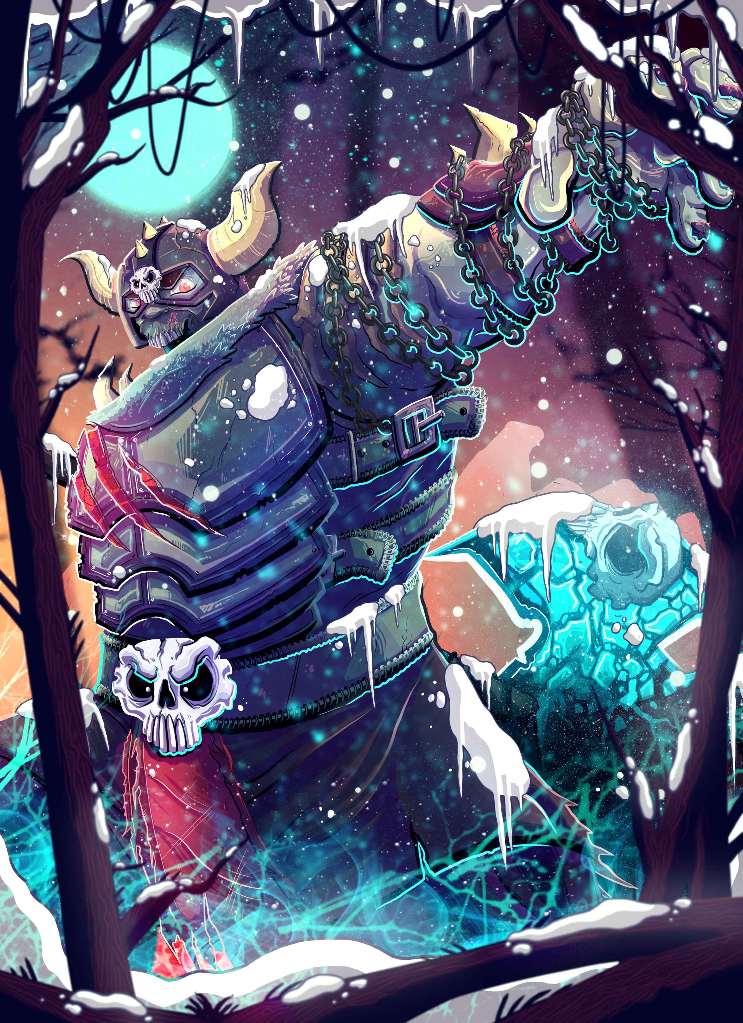
The first character I’ll be sharing (and probably one of my favourties) is the Zombie Viking! Weirdly enough I’d actually started my own project about zombie vikings which didn’t really go anywhere for myself, but it did mean that I’d already got quite a few sketches and ideas to work from, and the final design for the character ended up being heavily influenced from one of my own ideas from this personal project.
I spent a lot of time developing this guy and sketching out various ideas as we weren’t sure how zombified he should be, what type of armor he should have, what weapon he might have etc. I will talk more about what the card game is about in a future blog post but it has definitely been one of those where the client wants my ideas and style to come through and not that they want me to do it in a specific way that they envisioned, which is exactly the type of projects we should all be working on!
Once a general direction for the character had been decided on, I worked on refining his body shape, armor etc. until both I, and the client were happy with how he looked. I wanted him to have armor that was pretty unique like the rib cage on his shoulder and the style of his axe, but I also wanted to make sure he was quite clearly a viking.
Once the character had been fully refined it was time to draw up the final card sketch. This was fun and also a challenge as I’m still early in my career and I find it difficult to get the proportions and style of a character to look right in a completely different position to the one you started with. I’d recently got a book full of poses so had been practising a lot which I think really helped with overcoming this problem in this case. The focus of these cards is obviously always on the character, so I didn’t draw much of a background up as I know that I can usually just draft them in and go with spontaneous ideas as I go. I did actually rough in a ghost army background but decided there was too much going on when I was getting close to finalising the illustration.
I started out the rendering of this illustration quite confident as I feel pretty happy with my own style and process at the moment, but I knew that I wanted to elevate this whole project a little further and try to push myself and my work to that next level. Once the majority of the illustration was completed, I had one of those moments where I just couldn’t progress for quite a while because I’d been working on it for too long and now everything looked wrong. I didn’t like the colour and I was completely unsure of the whole thing and was contemplating starting the whole thing again.
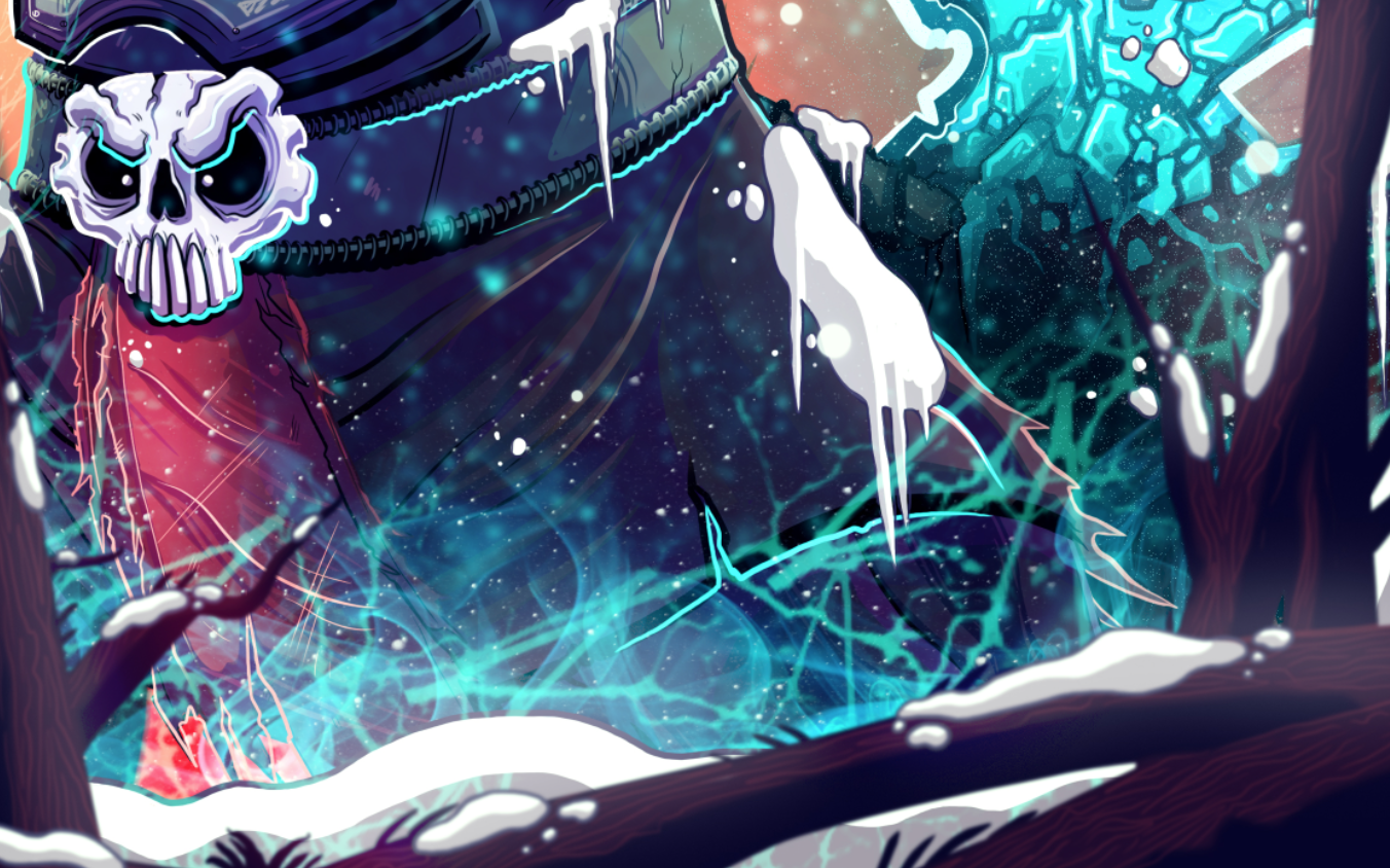
A few days away from a piece does wonders though, so I had a couple of days away, made some notes and came back fresh and ready to get him finished. I mainly worked on the colours and adding something a little extra to the illustration. So I worked on making his ice axe look more like it was solid ice shards and also added some snow to the whole scene. Snow and ice is something I’ve not really done much of before, so I felt like this was a reasonable element to add to the illustration which would challenge me enough to frustrate the hell out of me, but that I also knew would look really good in the end so I had enough persistence to want to finish each element and see how the impacted the final piece.
I’m glad that I did challenge myself for the Zombie Viking, and although it took a while I genuinely think it’s one of the best illustrations I’ve ever done. I am massively grateful to Riley who asked me to be part of this project, it’s great to have a client who has a great trust in your abilities and is also there to offer sound advice and a fresh pair of eyes when needed.
I hope that you guys liked seeing something new from me and I’ll be posting again next week, introducing you to the first female character from the game!


