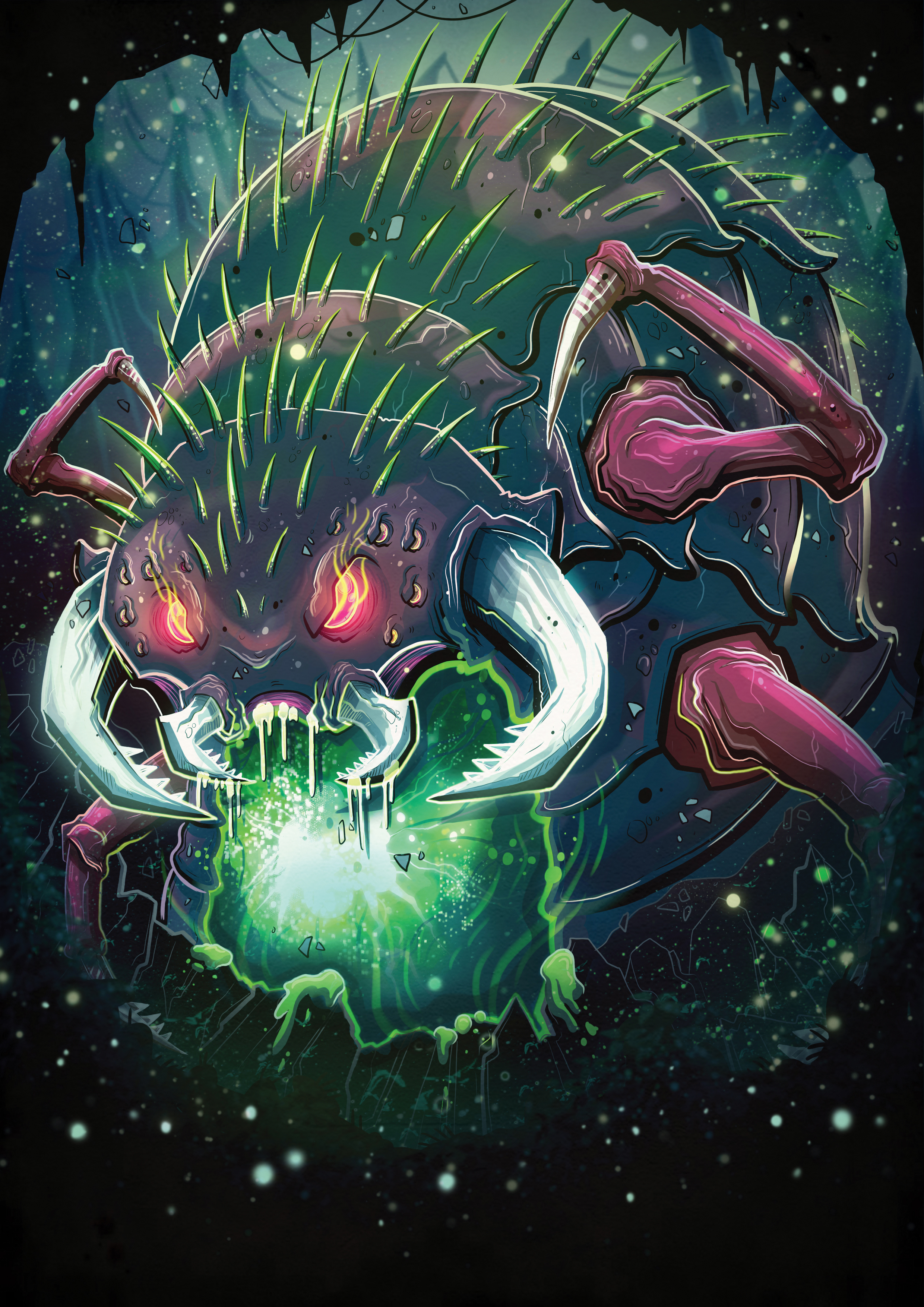
The Beast!
It's been a couple of weeks since I posted anything from the Escape from Fusion Earth project that I've been working on, so this week I'm going to share another character card, the only fully non-human character in the game!
This was by far the hardest card to get right, it was frustrating and time consuming, I had to take a lot of breaks from it and it was really hard for myself and the client to work out why it wasn't working. We figured it out in the end, and I'm really happy with how the card turned out. I think that because all of the cards are so different, they're going to look great when they're all laid out next to each other!
So first things, first, the sketch. This was so wide open, because the client basically just asked for a 'beast' card, and I pretty much had free reign on the design. So the first step was to decide what type of beast the character would be. I sat in Starbucks and sketched out a few varied ideas. Some were more furry four legged type beasts, some reptiles and some bugs, I felt it was important to explore a lot of options to start to get some direction for the final design.
Myself and the client decided that the bottom one was best, although I did really like the other two, I had to agree that there was something a little bit different about the bug type creature so we decided to go with that! We decided on a bright green and dark coloured colour scheme pretty early on, as I knew that I wanted each card to be varied in it's colour scheme so that they didn't look too similar when they're next to each other. However, for me the body shape and positioning wasn't quite imposing enough, so I decided to work on that a little.
I felt like this worked much better, although it did take so much adjusting and editing in Photoshop of the original drawing to get it to look right! I felt like it needed some more action adding to it as well though, the beast itself looks a lot more aggressive and dangerous, but it needed something more going on around it to show it in attack mode.
I added a few more rocks/flying pieces of land etc. to give the impression that the beast was breaking out of the ground, blurring a few of the pieces also added more of a movement to the illustration and gave it more depth. Although this obviously is far from the quality of the final image, it's best to set out a rough idea of everything so that you know where to work from. If your initial sketch is off, the whole illustration will be and once it's finished it's too late to fix it, so it's best to solidify your sketch first!
I decided to flip the final image in the end, as the Dinosaur Knight and the Zombie Viking were already facing to the right, I wanted to create a more even balance across the cards. From the start of this project I've always been thinking about how each card will look individually, but more importantly, how all of the cards will look together. Especially for something like this, it's so important if you're creating various illustrations that you know will be shown together, think about them as a group, and how they fit together, not how they look on their own.
Next week I'll be sharing the final character card from Escape from Fusion Earth, although, that won't be the last you'll see from the game, this is just the start! Here's a sneak peek of next weeks character!
Thanks for reading guys!


