Valkia - Rocket Commander T-Shirt
Anyone who knows me well will know I'm absolutely obsessed with Overwatch, I love playing the game, but I also love everything else about it, especially from a character designer's point of view, there's just so much inspiration in every part of the game. Last year I was contacted by Twitch Streamer Valkia to design some artwork for his Twitch channel.
He is a streamer I'd already been watching for a while, so it felt amazing to be asked to work with him. I completed the artwork which you can see here. As it turned out, Valkia loved what I did so much that he actually had the artwork blown up and transferred onto a whole wall in his stream room! Luckily a few months after I completed this initial artwork I got to meet Valkia in person, I got to see the artwork on his wall and we also sat down and bounced around a few ideas for some new projects to work on together. I've been working on turning one of those ideas into a finished product which I can finally share today.
What I've been working on is Valkia's first proper tshirt design, so I'm going to talk about the process behind that today because there were definitely some bumps in the road but as usual it turned out pretty nice in the end! Obviously because Valkia primarily plays Overwatch, we thought it would be best to tie this design into that. So I drew up some Pharah based sketches.


We decided to start moving forward with the one on the left, making some small tweaks but overall it was looking pretty good as the start of the t-shirt.....I'm going to get to the more 'obvious' problem I didn't notice next...


I started working up the design, I'd worked out a good way to colour it etc. I figured I'd worked out a good colour palette and then it hit me. I've never really worked on projects before where I've had to worry about copyright, and anyone who's seen streamer shirts will know that it's a wonder how a lot of them haven't been sued. So Valkia and I, had a conversation about it, contacted some people at Blizzard and decided to start fresh. It wasn't really a problem because we could both see the issue and knew we could create something more original. So we carried on using the basic design, but instead of Pharah, the character was going to be Valkia himself 'commanding' this group of rockets, a character we now have the option to do more with in the future. So I started out sketching some composition ideas, keeping the original rockets in place.
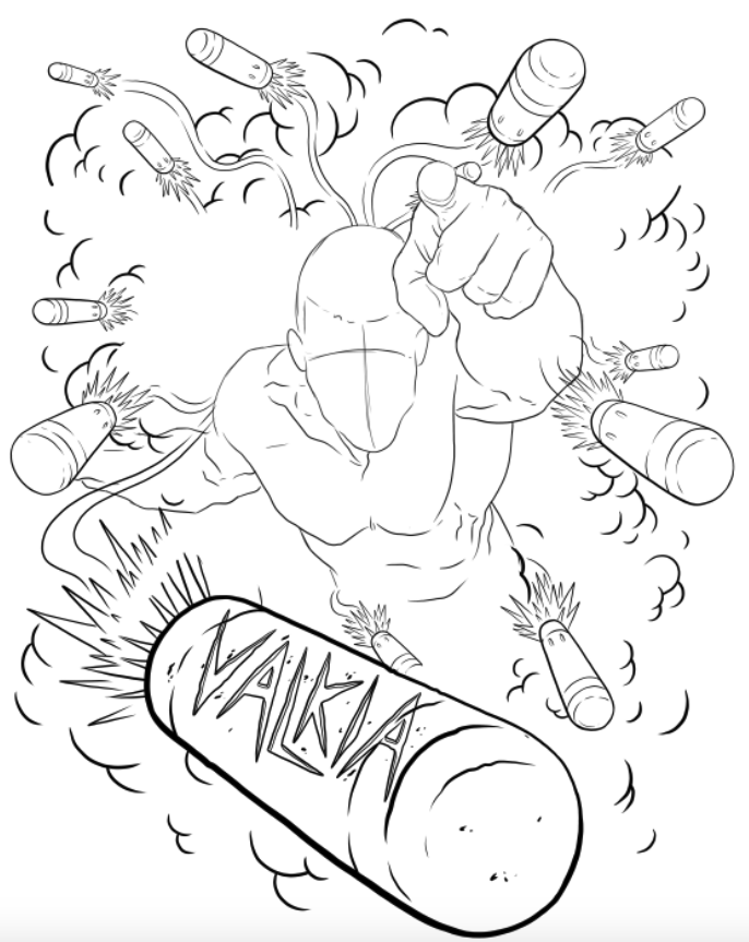


He really liked the middle option, so I started to move forward with that and create a more refined sketch. We wanted to make it obvious that it was indeed Valkia himself, so I added on his signature backwards hat for good measure. It was really important to Valkia that this tshirt design was dynamic and interesting to look at, so I added some explosions to the foreground of the design which added a good depth of field to the composition.

Anyone who designs t shirts will know that it can be extremely difficult if you're designing them to be screen printed because each colour has to be on a separate later and you should really only use between 1-4 colours. Of course you can use more, and it definitely gets done a lot, but the more colours you use the more you risk the design not printing well. We weren't sure if this was going to be screen printed or DTG but I personally prefer to keep a screen printed look anyway. So I started to lay down some basic colours while trying to figure out how to keep the colour count low whilst also making each element stand out.


I understand I'm kind of contradicting myself by using more than 1-4 colours in this design! But I knew by this stage it was going to be printed using the DTG method so I didn't really need to worry about colour count, although I still wanted to keep it as low as possible from an aesthetics point of view. I was trying to stick with greys and then reds, oranges and yellows.

It was all going to plan, until I got to the face. I just couldn't find a way to shade and light the face with a shade of red or orange that would also work on the other areas of the design without him looking extremely sunburnt! Sometimes, and I'm sure a lot of fellow creatives will relate to this, but you just need a few days away, working on something else so that you can come back to a design with fresh eyes. I know this can't always be done on tight deadlines etc. but I had the chance to do so on this project and it definitely worked....

I decided to not worry about the colours too much, and just try and achieve a style that would work well on a t shirt instead. I also found some better reference for the explosions so that they actually look like explosions and not some weird clouds. I think it was definitely that few days away from the project that allowed me to come back with a breakthrough and just instantly know what I wanted to do to finish it!

It was a pleasure to work on this with Valkia and the tshirt is available now here. I'd love to see photos of you in them if anyone gets one!