Creating a character design sheet for concept art
Last week I wrote about how I developed the creatures for the short horror film ‘Shredders’ which you can catch up on here.
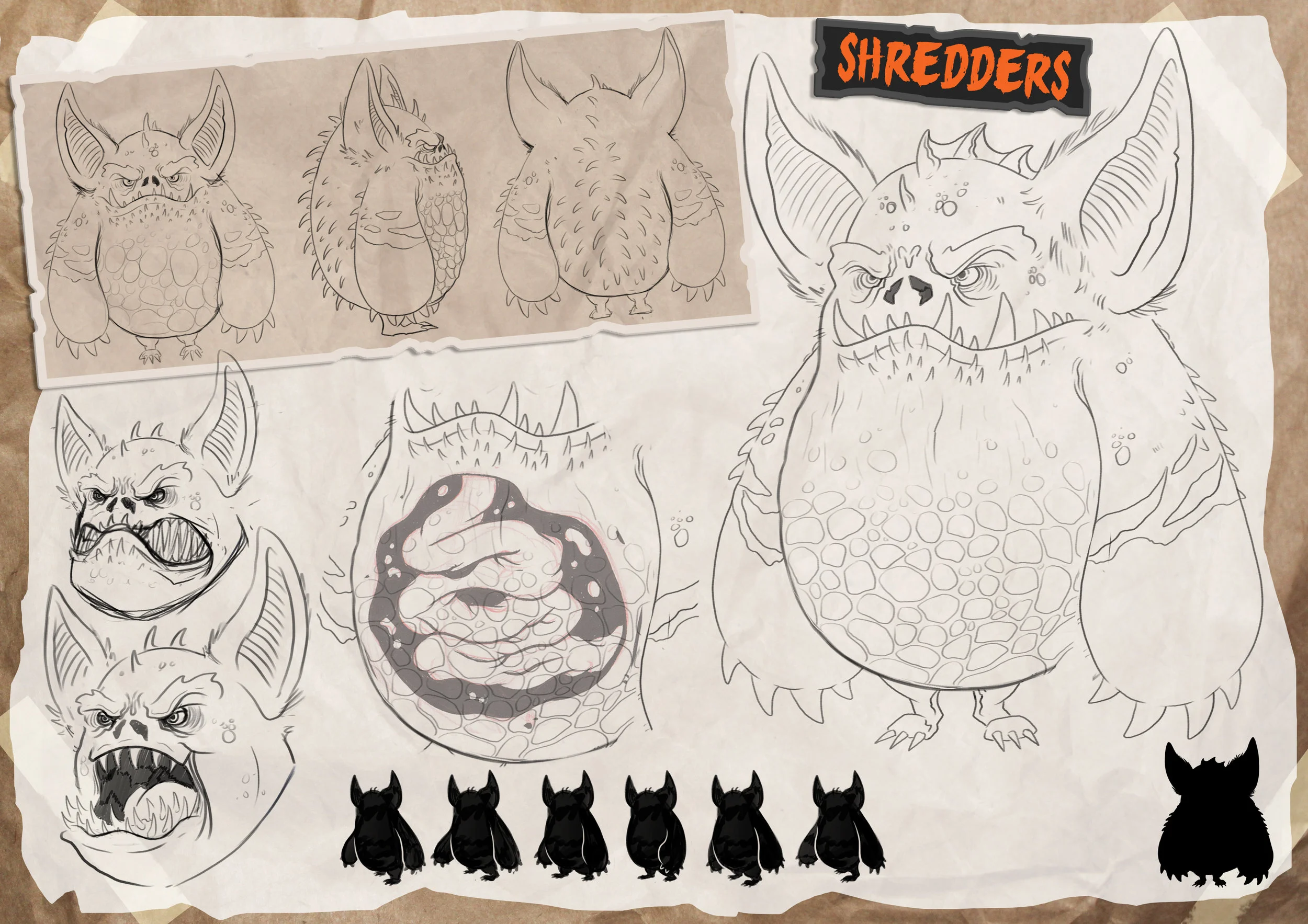
This week I’m going to talk about how I created a character sheet for the Shredder creatures as the whole point of this project was to produce an outcome that would allow the guys over at Posh Dinosaur Productions and anyone else working on the film to have a very clear idea of what a Shredder would look and act like if it was a real creature. A character sheet is where you get to communicate various elements of a character so that these details become easier to understand.
Creating the character sheet
No matter what you’re creating a character sheet for, whether it’s film, video games, plushies or toys etc. most character sheets will always include a turnaround of a character, which is basically a front, back and side view of the character, sometimes it can be more but as long as every part of the character can be seen that’s what mattered. That way, if the character does need to be made into a 3D model or product, it becomes much easier to do because the 3D artist can see what every side of the character looks like. Another thing that is usually part of a character sheet is character expressions, this helps to get the personality of the character across and also aids the 3D artist understand how the characters different features would move.
If you’re creating a character sheet and have a bit of free reign with it (other than the turnaround and expressions which I think are essential) you can use this freedom to really impress your client and show that you’ve really thought about the character in depth. So for example you could think about how they might move? Is there anything that triggers a certain emotion in them? Do they have any defence mechanisms that are visually interesting? Any interesting props that they are always seen with? Which is why I thought it would be cool to add in the silhouette of the Shredders run motion, it’s not something the client even mentioned, but I’d thought so much about this character that I envisioned it running exactly like a gorilla, it wasn’t essential but it’s that extra effort that helps to build the character even more into something believable. We also decided to do a variation of the Shredder creature where the belly is translucent which makes the Shredders even creepier.
I think that this is also a really good time to put your own spin on the design of the character sheet so I’ll quickly mention a few ways that I do that. I’ve always loved stickers, and once I found out how to create that look digitally, I throw it in wherever I can so that’s how I made the character expressions stand out, I also throw some digital masking tape in there for the same reason! As part of making the character sheet as visually interesting as possible, I also tried to think about the overall design of the character sheet itself, the film is actually set in a office, so I thought it would be perfect to make it look like something that might have been pinned up on someone’s office desk. I also did a couple of other more simple digital illustrations of the other Shredders just to build the world out a little more.
Bringing the Shredders to life
The character sheets weren’t the only thing that I got to work on for this project. The team also needed an illustration showing the Shredder creatures in full swing to be used in pitches and meetings, allowing people to see what chaos a group of Shredders can really unleash. Again, I had a lot of free rein with this part of the project, as long as there was destruction, Shredders and blood, I could do whatever I wanted. The film is set at Christmas time and the events take place at the office a Christmas party, so that needed to come across in the illustration too!
I tried to think about what the Shredders might get up to, what the office might look like after a horde of them have attacked and how to make it visually interesting overall. A couple of elements I always try to get across in my work are action, depth and a good use of colour. So I made sure to have the Shredders actually attacking rather than just being stood there, most of the Shredders also have lit up red eyes which means that they’re in attack mode. Having perspective in the image and placing the Shredders in different office cubicles helps create depth, especially with the main Shredder being so far in the foreground, I also used a really low angle to ensure the Shredders came across as intimidating, it almost feels as if you’re their next victim.
With the film being influenced by 80s creature features, it gave me the perfect excuse to experiment with an interesting use of colour that I wouldn’t have thought of otherwise. I originally thought, with it being an office space at night, I would just end up making it pretty dark and dull, but that extra piece of information about what the film was influenced by was the perfect fuel to try something different.
I also managed to get some video footage of me creating these pieces, so I’ll share some of that on my Youtube channel over the next couple of weeks!


