Creating Promotional Artwork for Ratchet & Clank: Rift Apart
You may have seen recently that I was fortunate enough to be asked by Playstation to create some promotional artwork for the launch of Ratchet and Clank: Rift Apart, to be featured alongside two Twitch streamer’s channels who would be playing the game on launch. So for this week, I thought it would be fun to break down the development of the pieces and a couple of things to consider when working with clients.
I also just want to reflect on how incredible this opportunity was for me, Ratchet and Clank is pretty much the main reason and inspiration for me wanting to work in the video game industry in the first place. Although I haven’t quite worked on the game itself (hopefully one day!), it’s inspiring for myself to think that I got to work on something officially for the game. I think it’s reinforced in me even more to ensure to set goals for myself, even if they seem outrageous, or if it seems like I’m never getting there, eventually with hard work, it will pay off!
I think it’s important to start by saying that this project required a pretty quick turnaround of just a couple of days, alongside my full time job, so I think if I had more time I would have probably pushed these ideas further, but there were also other limitations (good ones!) on the artwork too. I think the quick turnaround was actually beneficial though, because I really had to take advantage of the skills and knowledge that I have and apply it to the most important project I’ve worked on so far. It’s in times like these when it’s essential to have developed, and be confident in your own process, that’s not to say it has to be perfect though, we’re all constantly working to improve, but having the confidence to know you can complete a piece of work efficiently, to a deadline and to a high quality is key.
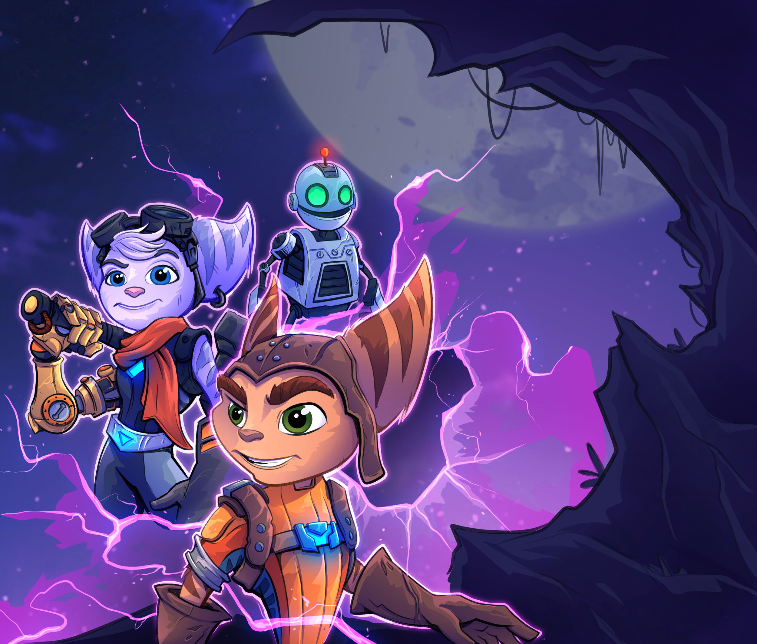
The main brief for the project was pretty straightforward; to create artwork to promote Rift Apart on launch day, to go into a template alongside some other graphics and to ensure the artwork included Ratchet, Clank and Rivet. As I mentioned this was a quick turnaround, so I didn’t have time to create lovely, high detailed sketches of ideas, I dove straight in and created some rough thumbnails, with a focus on the narrative and composition rather than the detail.

I love working on action scenes with a lot of narrative and depth to them, so my main focus was on those kinds of ideas and trying to think about different enemies that they could be fighting, and the different weapons that they could be utilising. One thing I knew was important was to ensure each piece of artwork was a contrast to the other, and I also wanted to make sure they felt different so that there was a clear distinction between the two. I made sure to offer a variety of different options to the client, so that they didn’t just have a set of really similar images to choose from, offering up variety is essential when working with a client, and always provide some safe options too. In the end, we decided to actually go with the simpler options, because to include enemies in the artwork, we would need to get approval from Insomniac, something I didn’t even think of, another key point to consider when working with an existing IP.
I’m not going to go heavily into detail on the actual process and methods behind these pieces, but I will post the build up of the layers and talk a bit about my thought process. I am planning on doing an in depth look at my process in a couple of weeks!


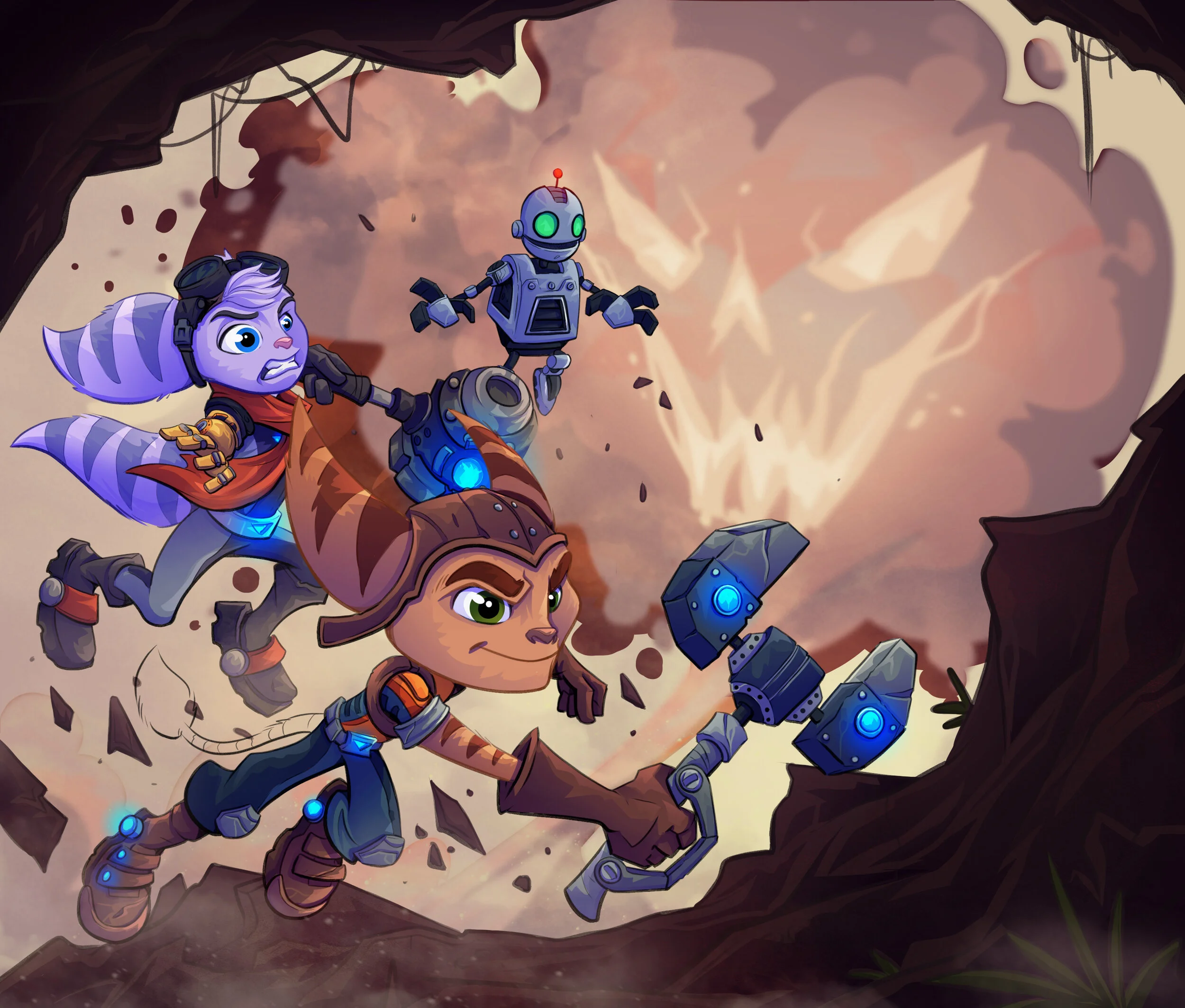
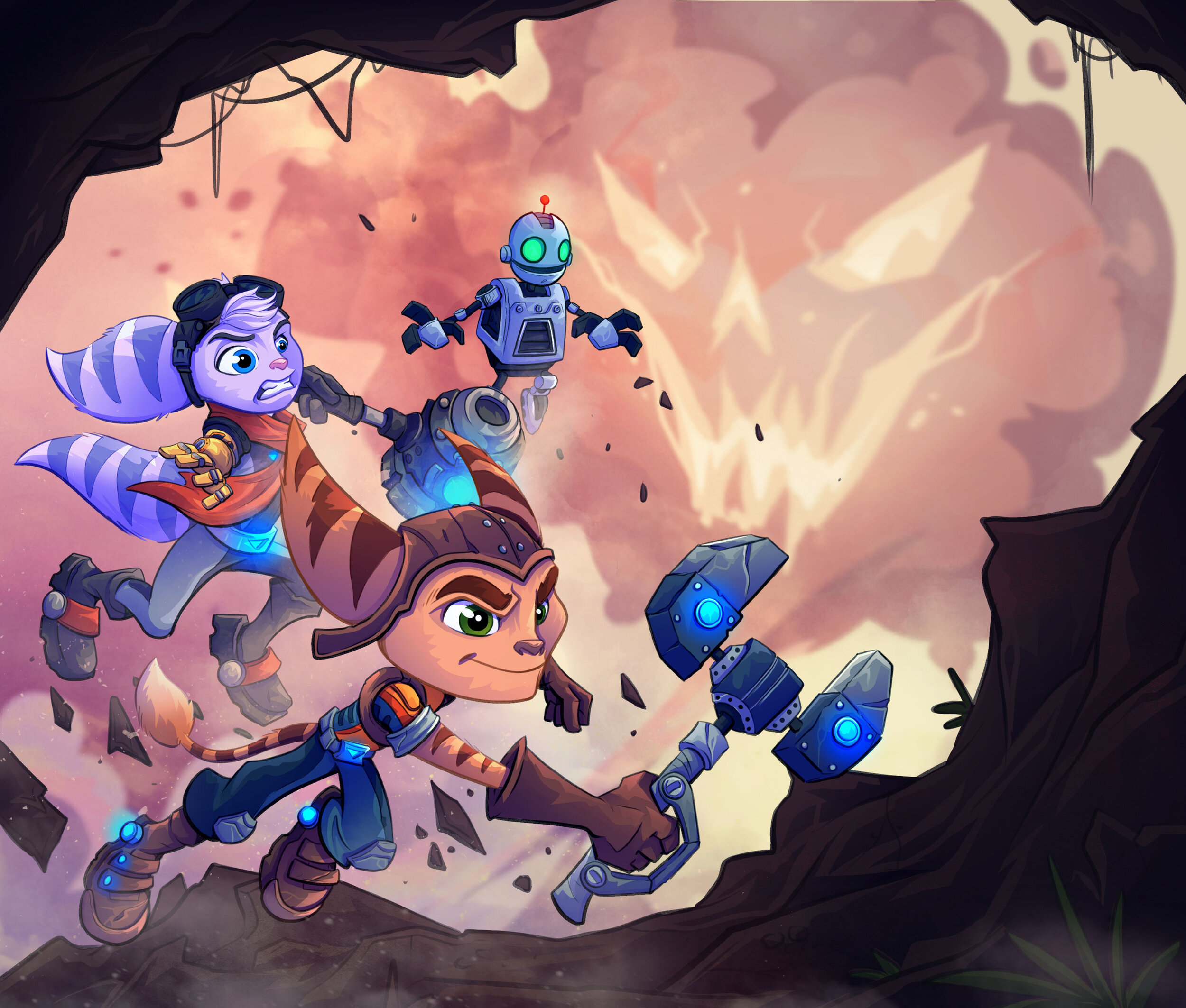
So first up is the piece where all three characters are charging towards the viewer, I knew the other piece would be in space so I wanted this piece to be on land and have a warmer colour scheme. First up were the lines! I tried to focus a lot on line weighting, where shadows would be and how lines should get thinner and lighter the further away the character gets. Next up were the flats, and then the shading and lighting, at this point, I don’t worry too much about colours or how dark the shading and lighting is, purely because I work in a way where I can easily change these things. I find if I worry about these things too early on, I will start to dislike the piece and become unmotivated, so I find it’s better to just get the work done and adjust after.
It’s at this point when I know I need to start fixing the colours and values, which is why I lightened the background quite a lot, I also blurred it a little to not only add to the smoke effect, but to also bring the clarity and focus back to the characters. I added a fair few layers of dust too, in front of each character and also behind all of the characters to really add some depth to the piece and imply movement, I find this makes a huge impact to a piece and really starts to make it come alive. The same goes for effects, you can see that I added some glows to Ratchet’s wrench and Rivet’s hammer which I think always makes to help a piece pop. However, I do think it’s always good to leave adding effects like this until late on, it can be really rewarding to see them push your piece that bit further after all of the work you’ve put into it, but if you add these too early, they’ll likely become distracting and not work too well if the foundations aren’t there.
Last but not least are the colour adjustments! I add a number of these depending on how the piece ends up, I use some level adjustments to help balance my values out and I usually use colour adjustment layers to harmonise the colours together a little better.
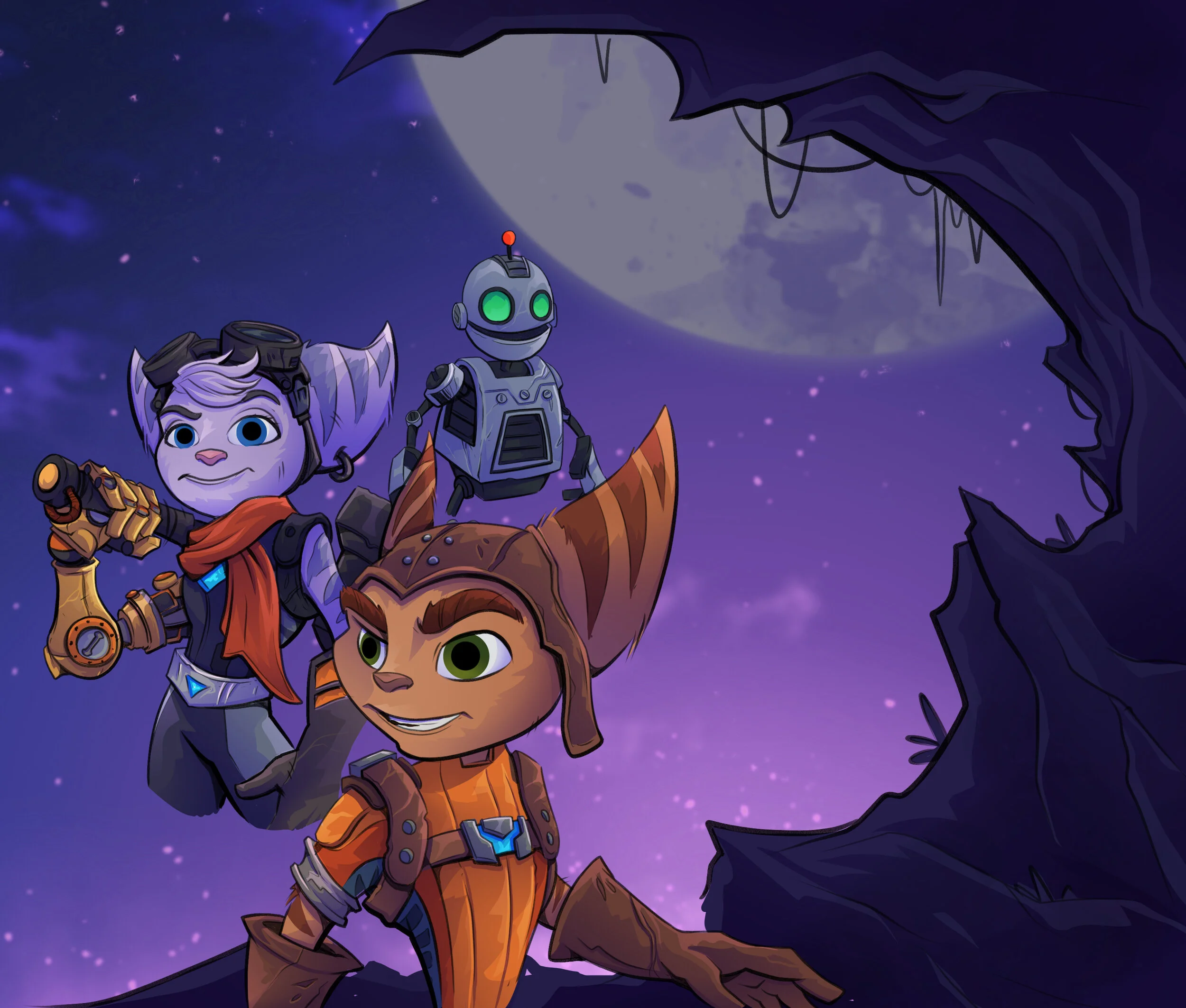
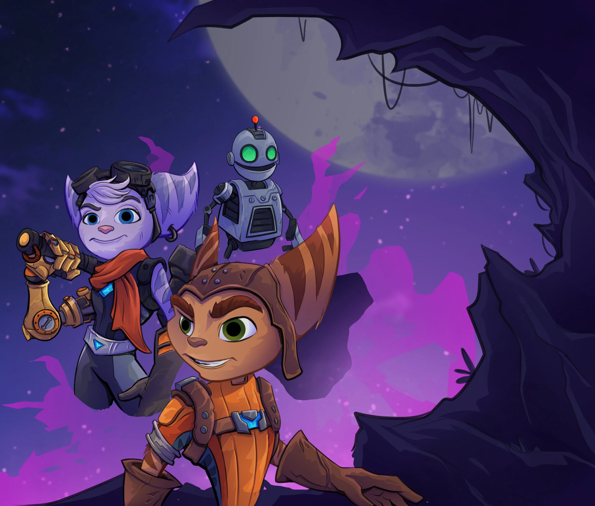
I’ll post the other piece I did too, but you’ll see that it’s pretty much the same process!


I am so so grateful to have been able to work on this project, and I feel like it’s given me a bit of a boost that I needed, I’m currently playing the game so I’m planning to do a bigger piece of fan art for it once I’ve played through the game a couple of times and figured out some cool ideas to show off how awesome it is!
Thank you guys for reading!