A look at the process of Gunnar!
It’s been a while! I must admit I thought I was back on track with the blog after my last post, I have ideas for new posts and lots of them are mostly written, but unfortunately health issues were a big thing over the last few months! This hindered me a fair bit, but fingers crossed I’m back on track now and have plenty to share with you guys!
The last you saw from me was a character I’d been working on called Noodle for a world I’ve been developing in my own time which I’m super excited about! So today I thought it would be fun to share the development so far for his partner; Gunnar. Noodle is a little bit chaotic to say the least, and it’s safe to say without Gunnar he probably wouldn’t be alive. Gunnar is an ex-bandit turned good guy after he wanted to get away from that kind of life, he wanted peace, quiet and to just appreciate the little things. So looking out for Noodle isn’t exactly how things were meant to go, but after being a criminal for so long, he made a point to commit to being a good guy. So let’s talk through the process of how I designed him!
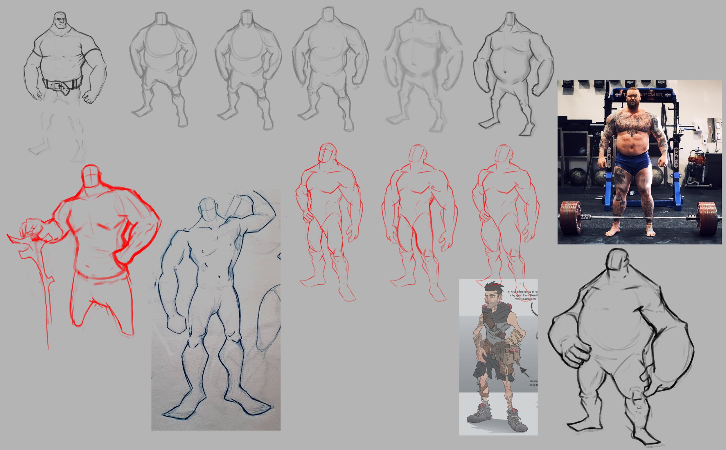
First up was the anatomy exploration, I wanted to use this project and world to really push my stylisation skills, especially when it comes to anatomy, so I got my reference and started to explore. Obviously I had much more reference than this to the side too, but you can get an idea of the initial exploration. You can see that it has different levels of stylisation throughout the exploration too, something that’s super important in concept art and the idea of not picking the fix idea without what seeing what else could work. This exploration is what allowed me to push the design further and eventually land on the bottom right with the really chunky forearms, a nice contrast to Noodle too!
Next up was the clothing exploration! I still have some development to do for this world so this will likely be developed more, but I knew I wanted an empahsis on practical clothing with lots of storage options and straps. I did initially explore the idea of making him kind of look like a biker but it wasn’t really sticking, so I put more of a focus on making him feel like he can take care of himself and portraying strength through his re-inforced clothing. Going back to these sketches I’ve noticed the roughed in fish and supplies he’s carrying on his back, something I didn’t continue to explore throughout the development. Definitely something I need to go back to!
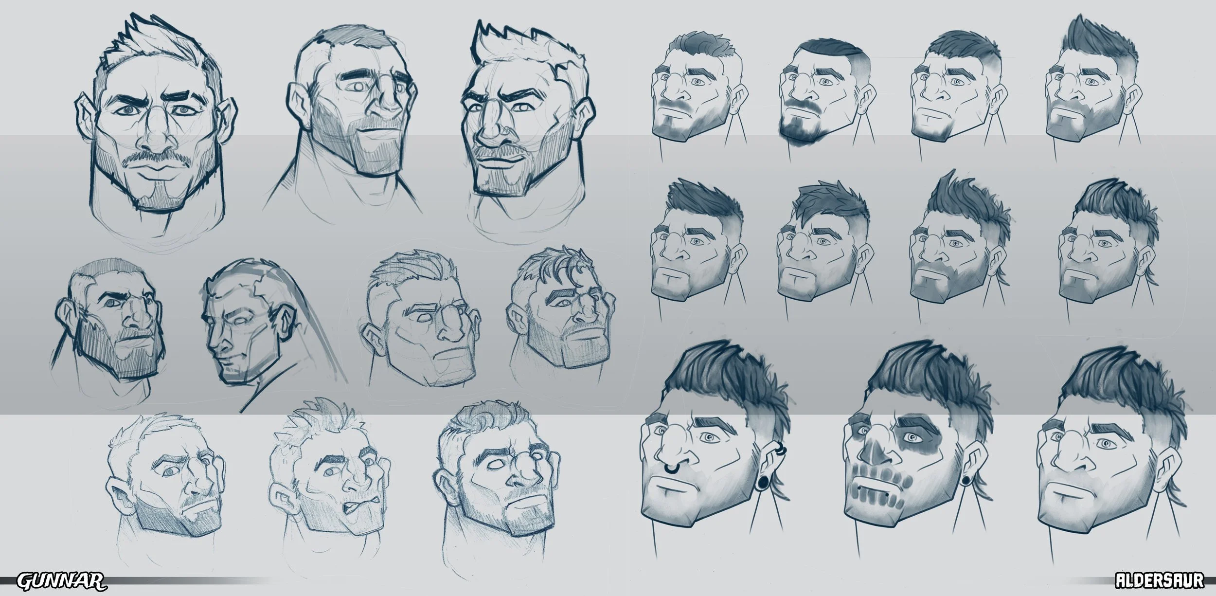
Working on the faces is always fun, I really wanted to focus on giving him a wider jaw and smaller eyes than Noodle. I’ll always start with some general face exploration to get a feel for how the character should look (left) with some more refined face exploration followed by hair ideas (right).
Exploring colours for your concepts is really important and can totally change the feel of whatever it is that you’re designing. I wanted Gunnar to feel quite grounded and neutral, with a connection to nature in particular. So for this exploration I stuck mainly to browns and warm greys with some areas of more varied colour exploration. Looking back on these too, I really like the idea of him having a skull painted on his face! This is one of the most fun things about exploring characters for me personally and really trying to understand who they are within their world, how they might evolve and react to situations etc. rather than just their base design.
Once I’d settled on a final design and colour, I began to work up a final rendering of him. I did keep the rendering pretty simple on this one which was intentially for the sort of style I’m going for with this project.
Here’s how he ended up looking in the end! However…when developing a character I think it’s important to not just stop there. Of course character design is ultimately about designing a character but there’s much more to it than this and a lot of fun can be had in really exploring the personality of a character within their own story and within the bigger story of their world.
So after Gunnar’s design was finished, I began to do just that; exploring who he is in the environment of his world and how he would interact with that world. You can see in the images below how doing this provides a much better understanding of the character, something that’s really useful within the character design pipeline.
I hope this was a useful insight into seeing how I design a character and flesh them out a little further than just a final design!


