Developing a Pirate Shark Boss - Creature Design.
As promised I’m going to dive into the development behind the pirate shark boss with 3 designs that I recently created. It’s important to mention again that this design was for a fantasy game and must be a treasure guardian boss, with strong ties to its surroundings while being large and imposing. All in all, it was quite an open brief! However, I’d been toying with the idea of creating a pirate shark for a while, so this seemed like a perfect project to develop that further with an end purpose for the creature in mind.
I definitely made things hard for myself as I decided in the end to have the boss go through 3 transformations, all of which had a fairly big impact on it’s appearance. The boss would start out as a general pirate shark, with a Captain’s jacket and a sword which would be used for it’s first round of attacks. After the player got a certain amount of it’s health down, it would become bigger and stronger, losing it’s jacket and becoming more of a beast-type creature. This is when it would begin using it’s huge arms to pound the ground and generate more of an AoE attack. For it’s final phase, it would become even bigger, but much weaker, losing the colour in it’s skin and it’s sight. Although it’s weak at this point, it’s pretty huge and relies on a fast charge attack in order to attack the player, knocking them back. The idea was that the more you damaged it, the more dangerous it becomes but when you do get the chance to attack, the much easier it is to get it’s health down.
First of all, I did a lot of sketching (which you can read more about on my previous blog post!) along with lots of studies and analysing my ideation along the way. I find this really helpful in order to make sure when I get stuck that I know why I’m getting stuck and also in order to make sure I’m actually going in the right direction and not just ‘going with the flow’. So I’ll often explore for a while, stop, ask myself what is and isn’t working and then make some notes in order to adjust moving forward. Below are a good amount of the initial sketches I did for all 3 of the creatures, trying to ensure that I didn’t just make him look like a shark in pirate’s clothes!


V1.
First up is the pirate captain shark! Design wise, I think this is probably the one I’m the least happy with, I did want to keep it quite simple as I was designing them for a stylised game, but I think I could’ve still done more. I do quite like how their coral elements turned out though and I think they really help to create an interesting colour scheme for the overall design. I was also keeping the shape language in mind and how that transitions, so this first version is much more rounded off in areas, especially the face with a much bigger eye too. With this being the first version you can see they have a lot more life in their design because at this point they’re still full of life (their health bar). Although I think I could’ve done more with this version, I do think they really stand out as a boss you would see in a game and be keen to approach to get a better look at.


V2.
Weirdly, version 2 is actually the one I ended up designing first, not intentionally but it just seemed to happen naturally. This is probably my favourite of them all and the one that I feel has the strongest design and fundamentals. Transitioning from the first version, their shape language becomes more angular and they become slightly more green. It’s at this point you start to also see wounds appear and most importantly, the key around their neck becomes visible! This was a really important part of the design for me, I wanted to make it clear that this boss holds the key to the treasure room. It’s not something you find within the room and once this becomes visible it becomes obvious to the player that they must defeat the boss in order to progress. If you’ve read my last blog post you’ll also know that I was exploring a bit of a different painting technique with this project, aiming for a more painterly look overall. I feel like this version really showcases my progress with trying to develop my style!


V3.
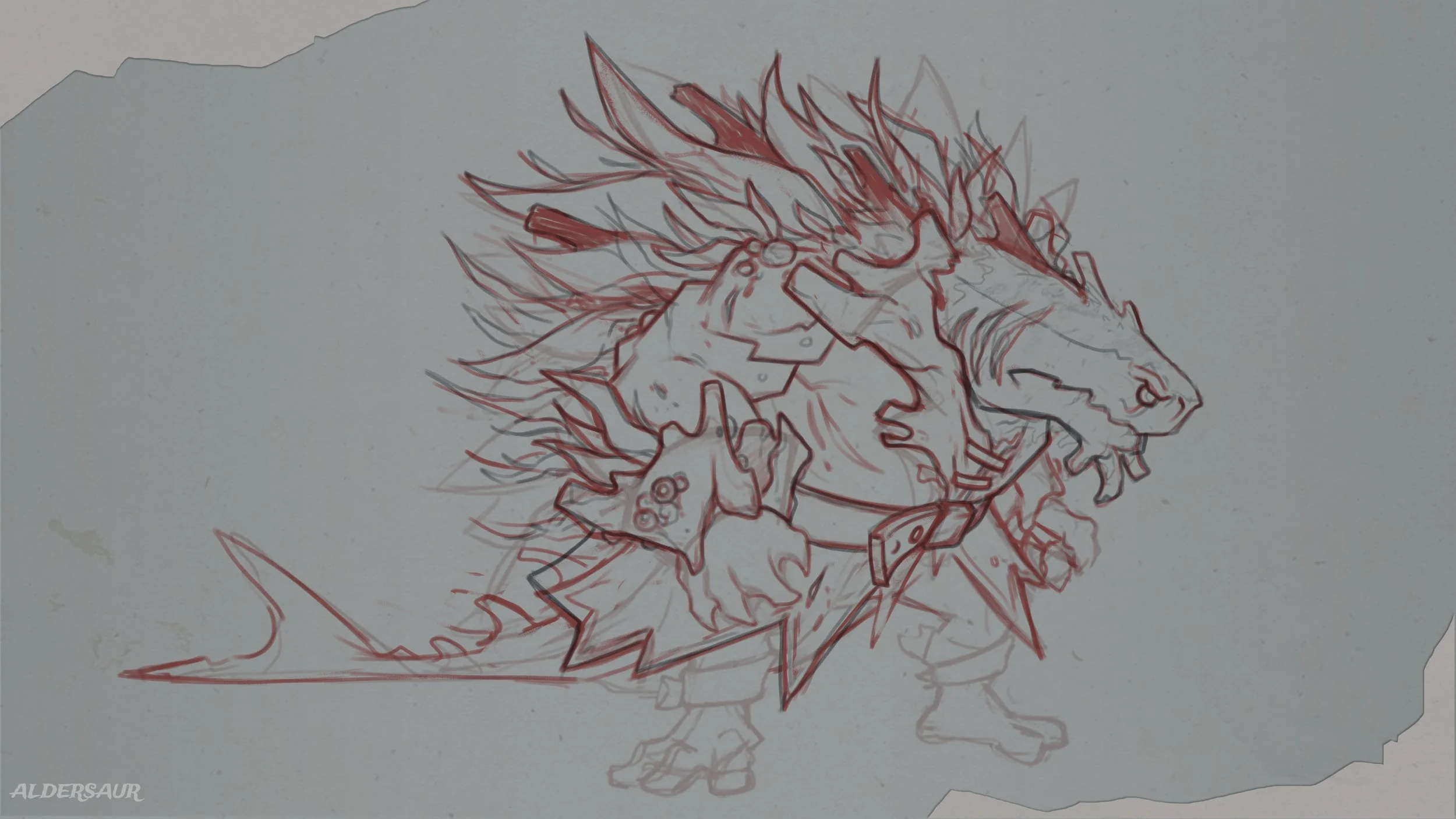
Last but not least is the giant of them all! By this point they won’t have much health left which becomes visible through their lack of skin colour, dead coral, dying seaweed and loss of light. However, the creature is much more aggressive and dangerous in order to protect themselves, charging at the player blindly in order to knock them back. They also utilise the dead coral on their back when charging forward, lowering their head so that the coral sticks out creating an additional ‘stab’ attack. Their overall shape has changed quite drastically too in order for them to be able to crawl around on all fours. I really like how the length of this creature turned out and using a thresher shark as inspiration enabled me to create a tail that I feel really enhances the overall silhouette of the creature.


As this was supposed to be the same creature through 3 different transitions, I ensured that I consistently checked the designs against each other throughout the process. I wanted clear identifiers that connected each creature in order for there still to be a connection. Putting all 3 transitions side by side shows this off nicely and I’d strongly advise creating mock ups like this in your work. Designing concepts is awesome, but it’s when you put it into context (like a mock up) that it starts to feel much more real and become more effective.
I really hope you enjoyed reading about this project, I could have gone on for a lot longer with this project, it was a lot of fun! I’m hoping to do some more bits for this in the near future so keep an eye out for those. If you have any questions about this project please let me know in the comments. Thank you for reading!